What is a chart in Ubikey?
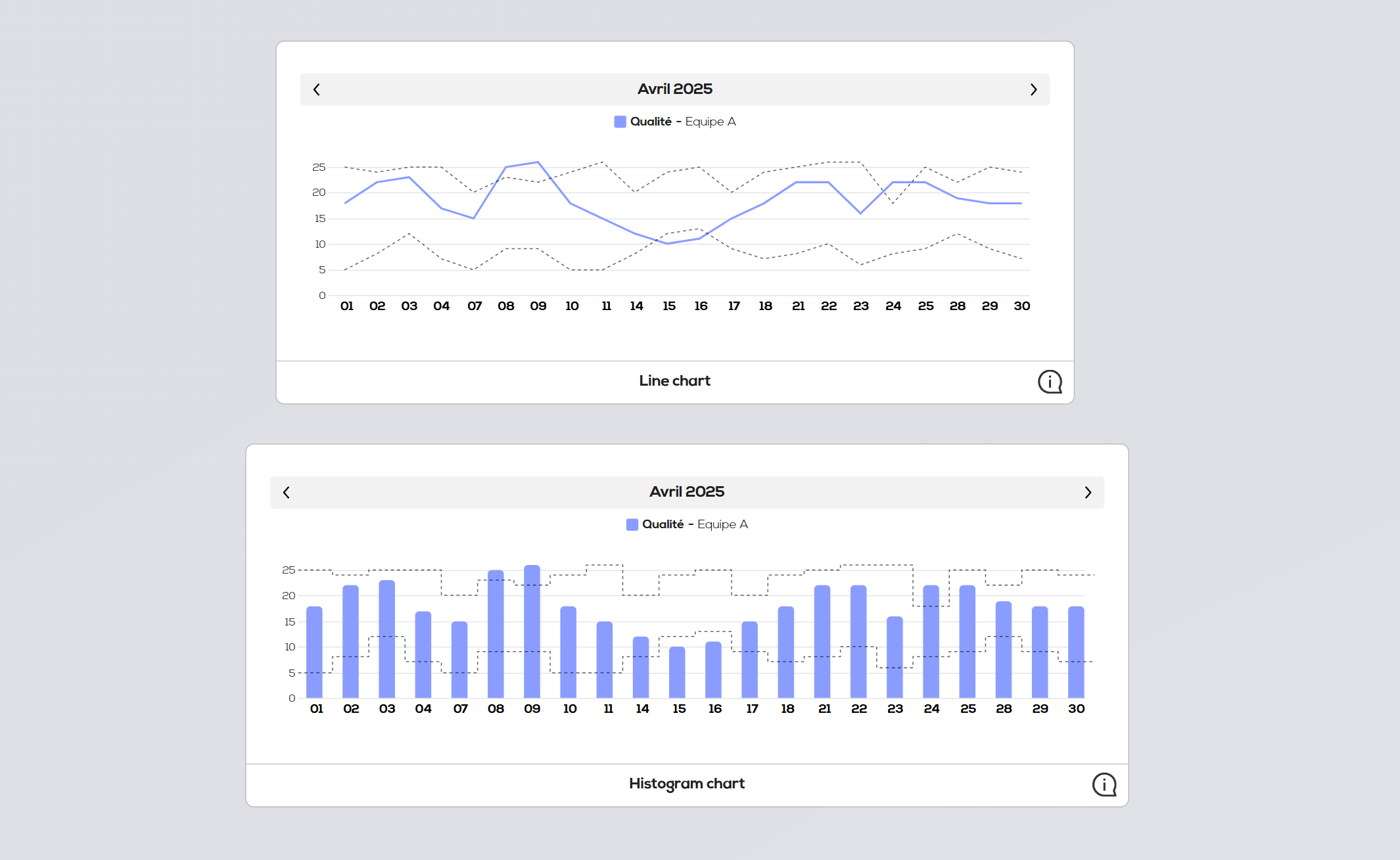
The chart view is an indicator view that enable you to represent a numerical indicator in the form of a curve or an histogram.
The analysis frequency and period are fully customizable.
Create a chart :
As for other indicator views, start by right clicking on your document background and select "New indicator view".
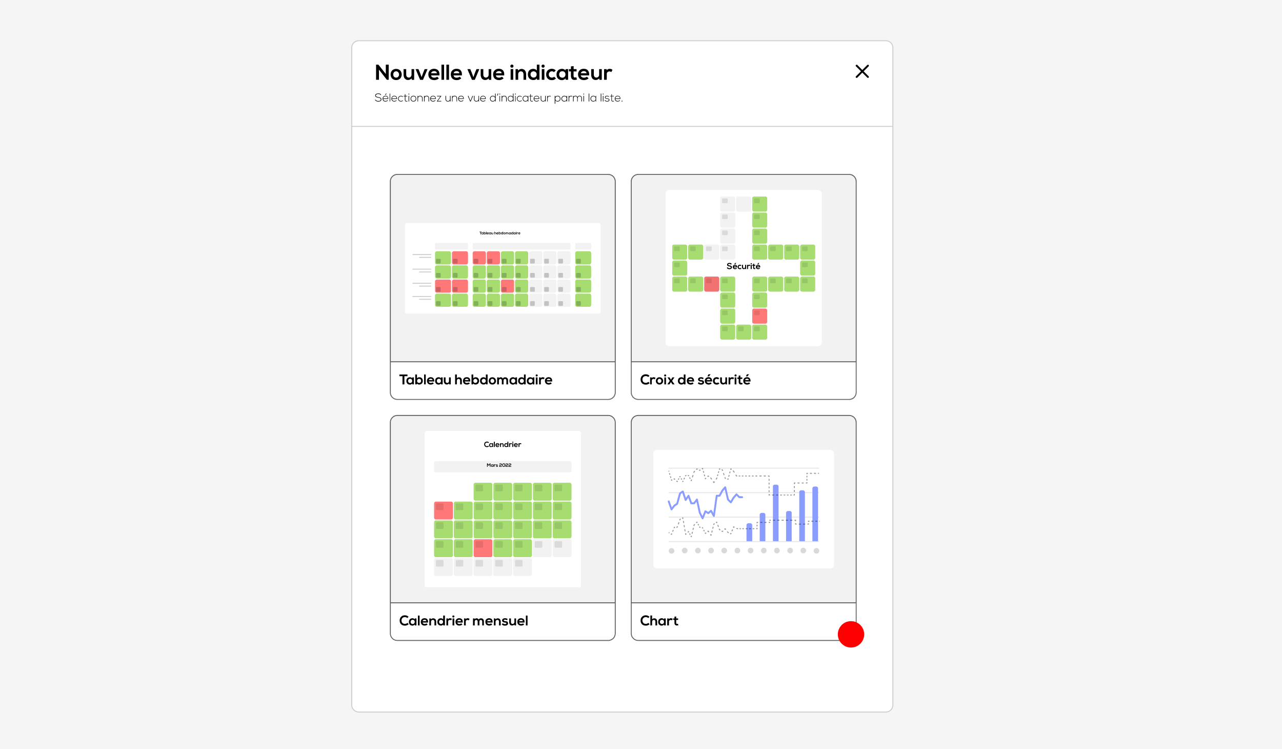
Place your cursor over the "Chart" cell and click on "Select"
The configuration window of your chart opens :
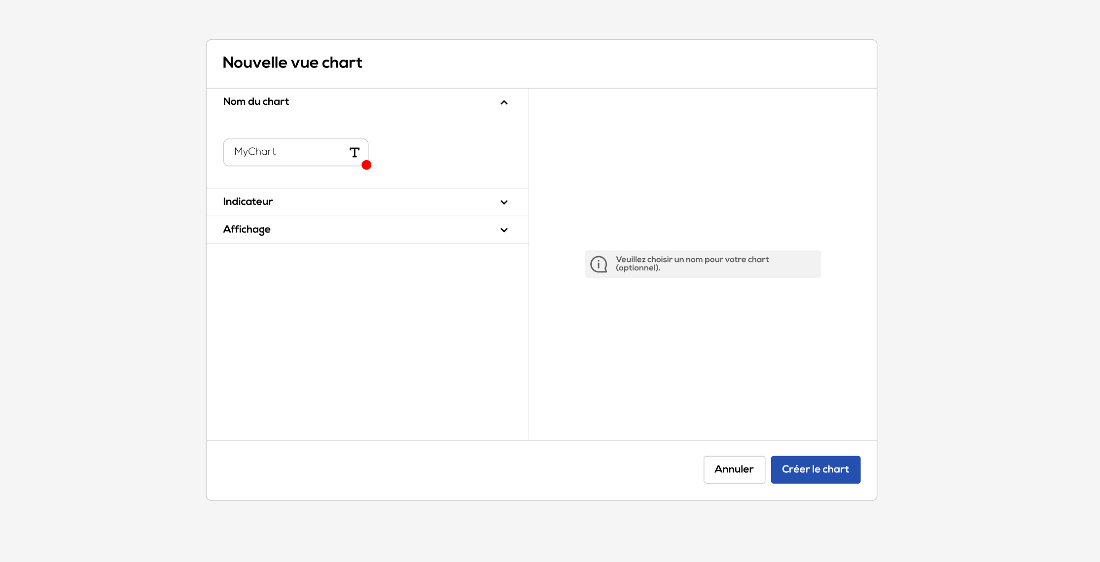
You can choose a name for your chart (optional), it will be displayed at the bottom of the chart element. Then click on the "indicator" section :
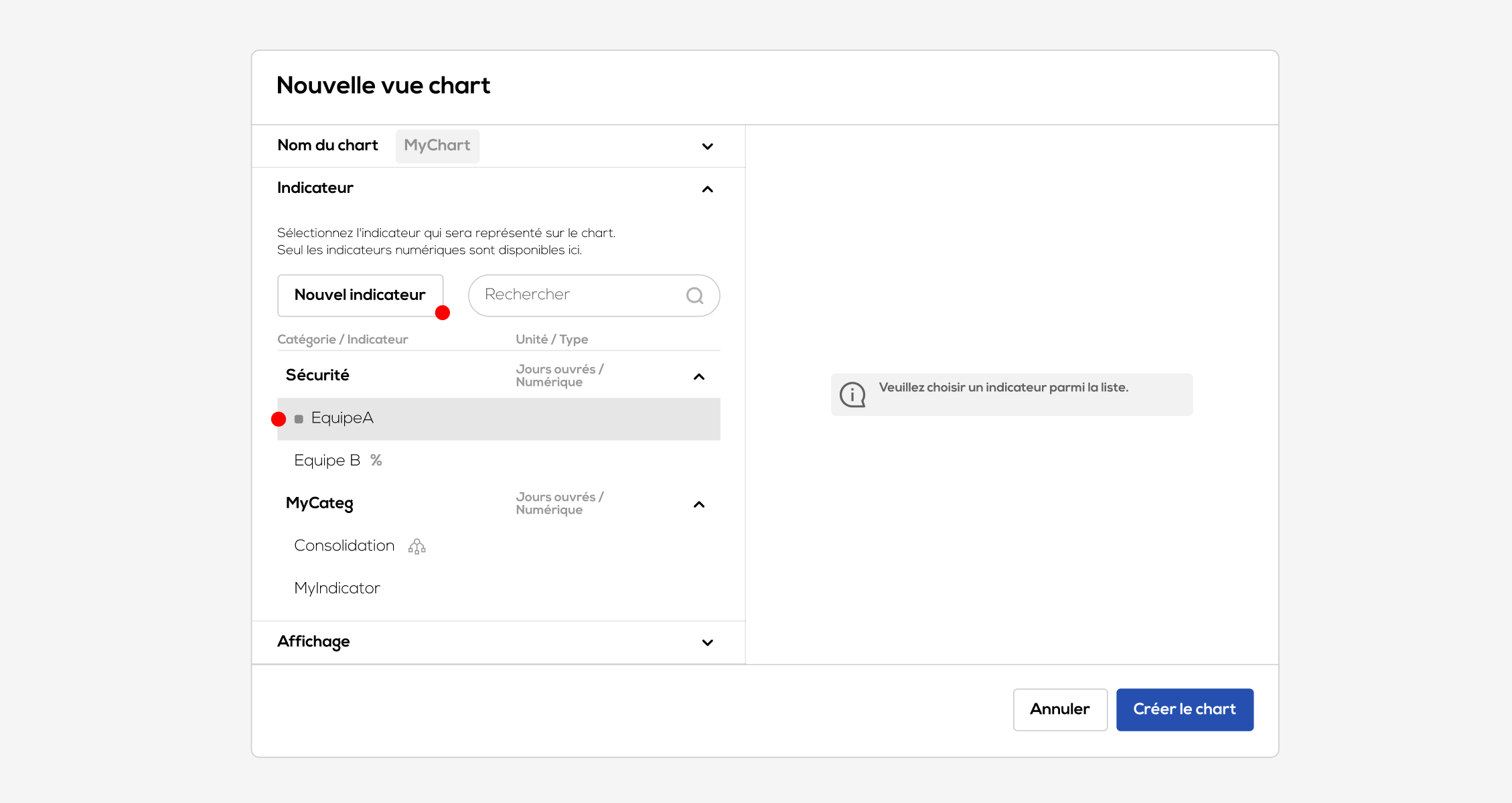
Select the indicator that you want to represent from the list or create a new indicator (more on indicators and their creation in the article : Indicators).
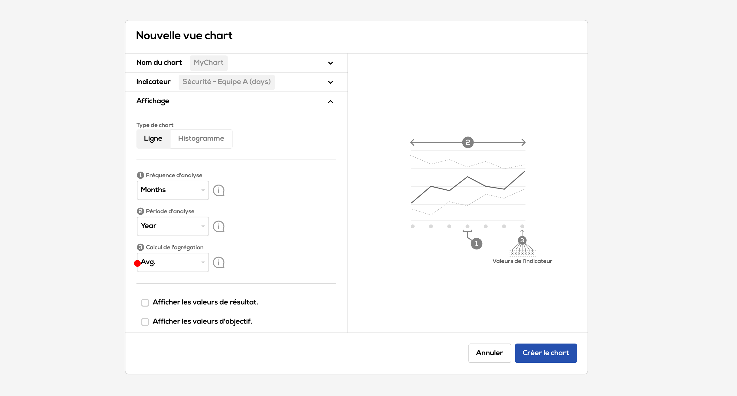
Then click on the "Display" section :
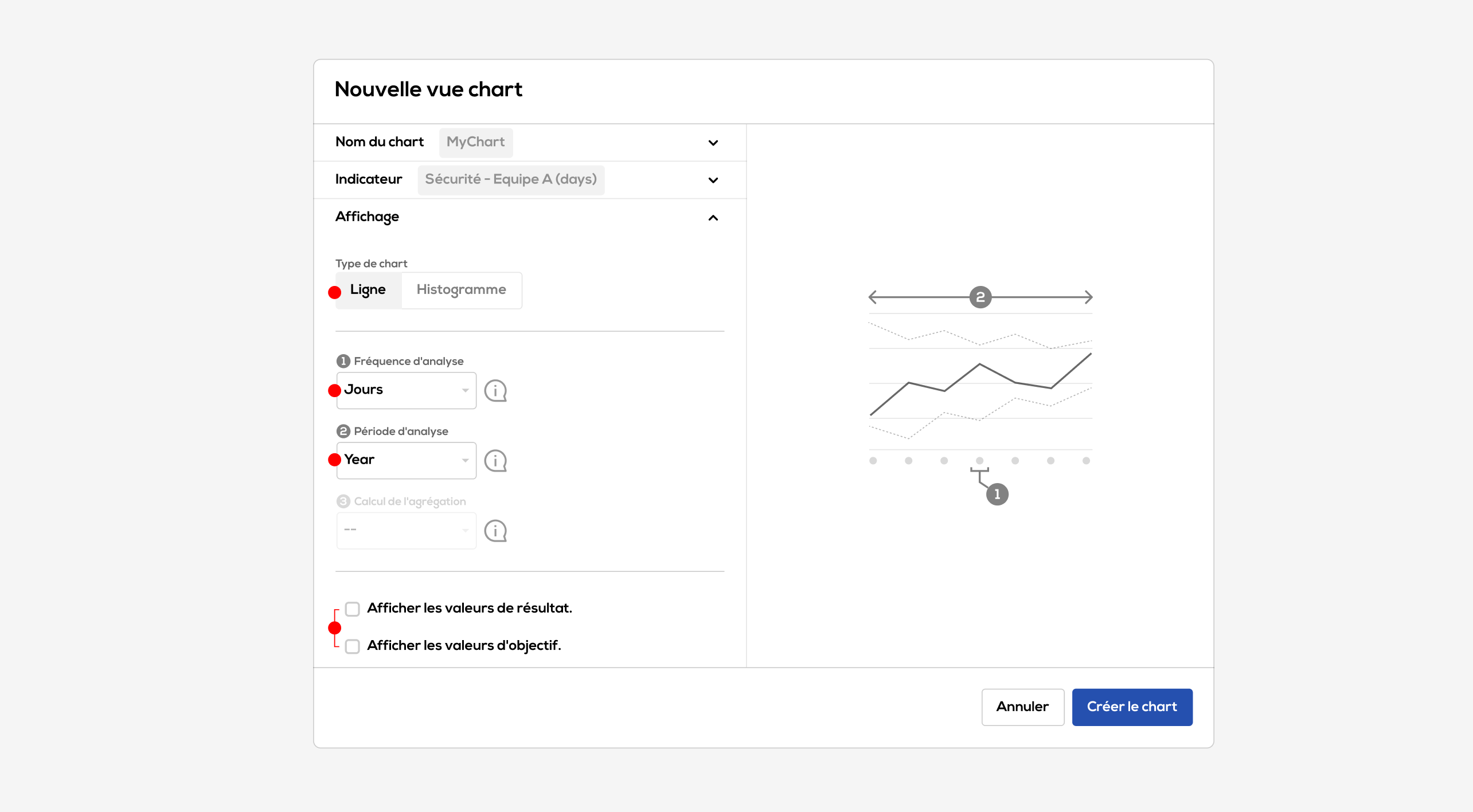
Please note : all settings in this section can be edited after the creation of the chart.
- Choose a type of representation between "Line" and "Histogram".
- Choose an analysis frequency : equivalent to one value of the chart. This frequency can be equal to the indicator unit, in that case each indicator value is individually represented on the chart. It can also be longer than than the indicator unit (for example a weekly analysis frequency for a daily indicator) , in that case the indicator values will be aggregated according to the chosen calculation mode (see details below). On the other hand, the analysis frequency cannot be shorter that the indicator unit.
- Choose an analysis period : equivalent to the duration represented on one "page" of the chart. It must be longer than the analysis frequency.
- You can choose to display or not the result and objectives values permanently on the chart by activating the associated checkboxes.
Data aggregation :
If the analysis frequency is longer than the indicator unit, then the "aggregation calculation" parameter become available. It define how indicator values will be aggregated (sum, average, min or max).
Then click on "create chart" :
Indicator charts
Your chart is now created in your document. It can be handled the same way as others Ubikey elements.
Use the header to navigate within the differents periods (previous period, next period, choose a period).
Furthermore, by hovering your cursor over one part of the curve or one column of the histogram, the detail of the result and objectives values is displayed.
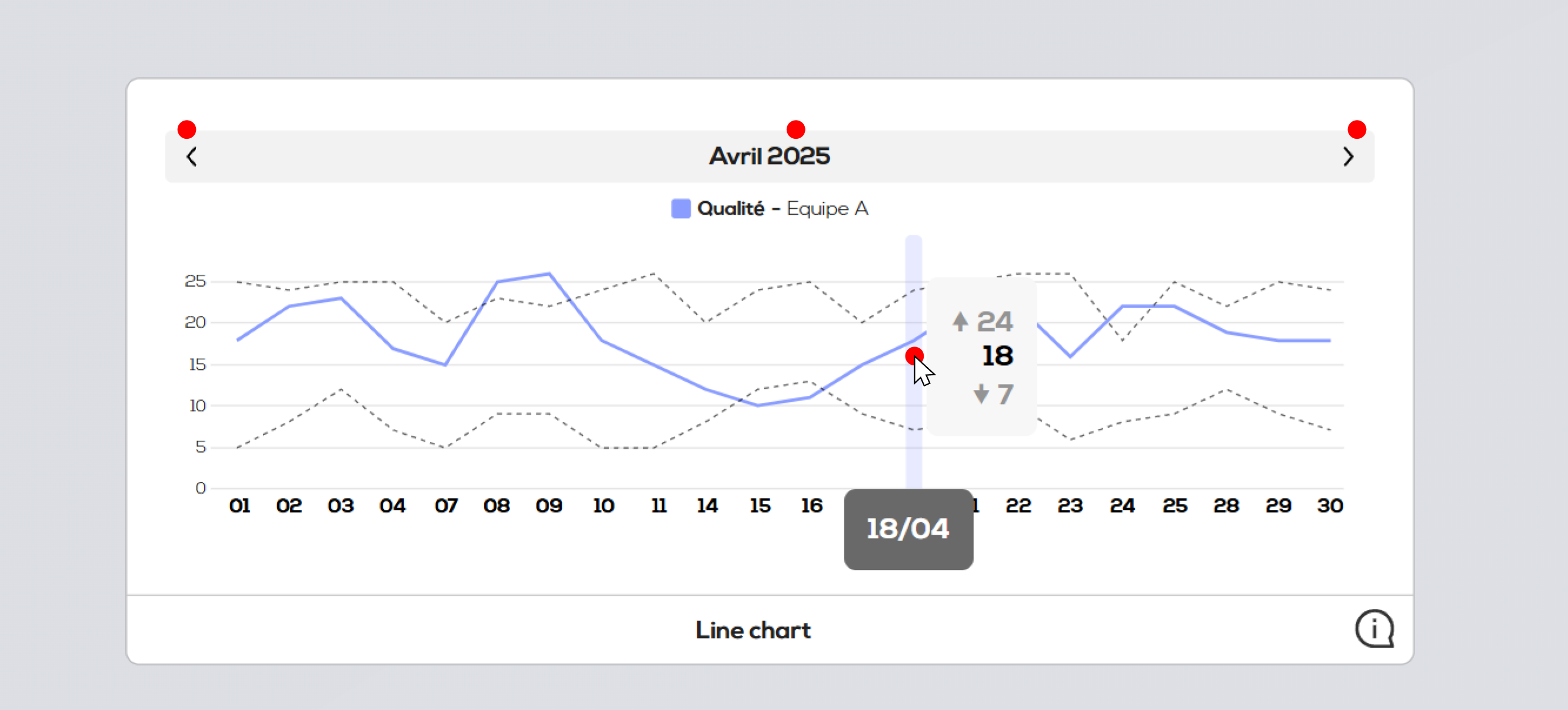
Click on one part of the curve or on one column of the histogram to edit the corresponding value(s).

- Use the calendar to choose the date to edit.
- Result field
- Min objective field
- Max objective field